

In autumn of 2020, I graduated with first-class honors with a Master's of Science in Psychology of Art, Neuroaesthetics & Creativity from Goldsmiths, University of London for my dissertation on the visual language of pain. This is the same topic that my self-designed Bachelor's from Duke University is in, neuroaesthetics. Neuroaesthetics, as a discipline, is primarily interested in unpacking the biological and neuroscientific characteristics of art-making and art appreciation. I think this discipline is crucial to understanding what it means to be human, something I speak to in an interview with the Convergence Initiative, an organization dedicated to examining this intersection.
Like most academics, I felt really proud of my dissertation, but I knew that even if I published it, my findings might never reach a broader audience in any meaningful capacity - that even my friends and family might never understand or find it useful because it's a dense work of scientific writing, data analysis, and literature review.
For some disciplines, we can't expect research to be comprehensible (or even relevant) to laypeople. However, my research is about how we consume images, understand pain, and empathize with others - I think we can all find something of value in that. I believe that knowledge is mostly useless if it's not accessible, so I made this visual narrative companion that explores my research original hypothesis and findings. The study was also published in 2024 in the Journal of Psychology of Aesthetics, Creativity and Arts. I hope you enjoy!
K. L. Graywill

CITE THE ARTICLE
Graywill, K., & Chamberlain, R. (2024). The visual language of pain: The role of rendering style and pain type in aesthetic and empathetic appraisals of painful images. Psychology of Aesthetics, Creativity, and the Arts. Advance online publication. https://doi.org/10.1037/aca0000692
Before you start:
1) For readability purposes and functionality of the interactives, I recommend reading this on desktop!
2) As a content warning: There are depictions of bodily injury, blood, and pain ahead.


I give you two options:
For you nerds who want to see the nitty gritty.
For those less statistics-inclined.

I. Introduction
My dissertation study aimed to address a gap in scientific research surrounding what kind of images have the capacity to evoke empathetic behavior, and what characteristics of those images enable them to be perceived as beautiful. When we think about beautiful things, we tend to associate them with pleasure - things that we like looking at, listening to, etc. However, there are countless examples in art, of all mediums, where people find satisfaction in stimuli which are painful, melancholic, even gruesome. A good deal of scientific literature already exists exploring the idea that aesthetic emotions - emotions we experience in response to aesthetic stimulus - range a wide spectrum of emotions spanning interest, surprise, disgust, anger, pride, and more.
Not only are these negative experiences brought forth by art accepted by us, but they are also actively sought out, so much so that many artworks are actually designed to elicit shock, fear, or sadness. This curiosity for unpleasant stimuli has led scholars to consider depictions of pain and violence as objects of contemplation and aesthetic interest.
You've probably encountered many of these types of aesthetics in your daily life, such as...


Note: I have included sources as hyperlinks where I felt appropriate, but I use them sparingly to avoid overwhelming the text. There are over 100 references in my dissertation and everything on this website is pulled directly from that document (in the same order more or less), but if you are really thirsty for more sources, it should be easy to have a peek at the corresponding section of my dissertation.
...viewing art at museum,


or watching horror films.

listening to sad music,
In fact, this idea that people can derive pleasure or satisfaction from aesthetic experiences which are disturbing or saddening (or have a negative emotional valence) is so pervasive that scholars as far back as Aristotle have been questioning the nature of these experiences.


Aristotle's paradigm called the paradox of tragic pleasure, from his work Rhetoric, was built around this. He wondered how a performance that evoked feelings of fear and pity could compel thousands of people to sit in an amphitheatre and watch it play out. He theorized that there was something about this spectacle that transformed an audience’s tragic pathos into enjoyment. Over the course of thousands of years, philosophers have continued to develop theories describing this phenomenon.
Hover over some of the terms below to learn more.


Now, tackling this age-old philosophical paradox was beyond the scope of my study, but understanding the philosophical underpinnings of art and pain helps lay the groundwork for the next important conceptual piece of this puzzle: empathy.
Empathy, a nebulous but ever-present term in this discussion, has always been central to aesthetics – philosopher Robert Vischer coined the German term Einfühlung, the word for aesthetic sympathy, which later became translated as empathy. Empathy stands out amongst other emotional-sharing states in humans because it also has the capacity to motivate observers to alleviate suffering, on top of adopting an emotional state. So, being able to understand or share someone’s pain (empathize with them) is a distinctly different phenomenon than compassion or sympathy (feeling badly for them). That said, empathy remains a somewhat ambiguous term, used in different ways by artists and scientists, and can generally be broken down into three categories:

Affective empathy is the act of sharing or feeling someone else's emotional state.
Motor empathy, associated with mirror neurons, is the brain simulating the physical actions of another.
Cognitive empathy is an act of mentalizing or understanding another's mental state.

These distinctions are crucial in scientific literature - for example, research suggests that individuals with psychopathic traits have the capacity for cognitive, but not affective empathy – i.e. they are able to describe or mentalize another’s pain, but not share it. Treating empathy as a multidimensional measure added important nuance to my own study.


So what does science have to say about all this?
Well, before I can get into that, we have to first understand at how scientists look at art. Scientific experimentation is all about manipulating and controlling certain aspects of a procedure or a stimulus in order to observe patterns and differences. As you might imagine, there are dozens of factors that affect our consumption of art and images. This makes it difficult to tease apart what features are actually driving responses to aesthetics, so we use frameworks to help us understand the structure of all these features.
Interact with the image to learn how each component of this scene affects our perception.


Investigating responses to art by manipulating pictorial context provides us an opportunity to observe differences in responses due to bottom-up (stimulus-driven perception) processing, outside of higher order top-down (cognition-driven perception). Even the most minute visual properties of an image - texture, form, color, etc. - can give viewers important information about the image. This makes pictorial context an interesting candidate to consider when designing a study that involves perception of art.
Consider the two glyphs below. Same letter, same information, right? Hover over them to see how a simple change in font can alter how we perceive the images.


For this reason, pictorial style can make a huge difference in how we perceive an image, regardless of its actual content - in the case of my dissertation, painful content. Photographs, pencil sketches, or fully rendered paintings of the same content can all vary widely in their emotional impact, aesthetic value, and context. Below is a selfie of me and two illustrations I made based on it.


None of these images are equivalent.
They depict the same person, in the same pose, but they are rendered completely differently. Why am I driving this point home so much? It's because images, and art, are complex, and when science studies art, it has a tendency to reduce things down to their most essential features. As a result, many of the studies in the realm of neuroaesthetics tend to use artistic stimuli that lack ecological validity. This is the idea that what we use to study a phenomenon in the lab may not be fully translatable into the real world. (For example, it's difficult to study brain activity in response to live music because we can't mimic a live concert inside an MRI machine.)
In studies about art and pain, in particular, often researchers will compare how participants respond to depicted pain rendered as a photograph or rendered as a simplistic cartoon, or they use famous artworks (which carries its own set of biases). My aim was to explore the relationship between pain and art, but using stimuli that came closer to approximating a true art equivalent. As an artist myself, I have the ability to make this possible.
Before I get into the specifics of my study, and now that we've covered the basics, let's take a look at three studies that were critical in forming my hypothesis. Hover over the images to get a simplified idea of the study's results:


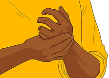
1. Gu & Han (2007)
In this fMRI study, participants viewed images of hands in neutral and painful positions, rendered as photographs or cartoon illustrations. The cartoon illustrations failed to evoke responses in the areas of the brain associated with negative emotions and pain (ACC, right insula/putamen), which the authors cite as a product of reality constraints, i.e. the cartoon depictions lacked the robust color and texture information needed to make it a stimulus reality and produce the same neural signature as the photographs.
2. Ardizzi et al. (2018)
This study explored sensorimotor reactions to depictions of pain in Renaissance artworks, specifically using human faces (unlike Gu & Han (2007), which used isolated limbs). It demonstrated that aesthetic appraisals were directly related to empathy. Participants who were not asked to suppress their facial expressions when viewing painful artworks - who were able to enact motor mimicry (measured by activation of the corrugator supercilii muscles), rated artworks as more beautiful than those who had to suppress their facial expressions.


3. Jamrozik et al. (2019)
Here, researchers examined how people judge the character and personality attributes of people with and without facial disfigurements, rendered as photographs and as oil paintings. They found that when the faces of people with facial disfigurements were rendered in the oil painting style, it reduced the existing negative bias against them in personality measures (agreeableness and extraversion), suggesting that artistic depiction can attenuate negative valence of images.
Note: The painting used in the Ardizzi et al. (2018) study is Prometheus by Theodoor Rombouts (1597-1637), which was an actual stimulus used in this study. The other stimulus examples belong to me, but represent (to the best of my ability) the visual transformations used by the authors of these papers for their stimuli. (I just don't have permission to reproduce them, so I made my own examples.)

What then, was my hypothesis?

The first aspect of the existing literature I wanted to address with my research was this idea from Gu & Han (2007) of a stimulus reality, which suggests that images need to accurately simulate reality in depth and form, in order for our brains to produce empathetic responses to depicted pain. I believe this is fundamentally misleading about the strengths of 2D images as representational forms. I wanted to create stimulus fictions that took advantage of art's strengths to capture pain by invoking visual analogies, creative use of color, symbols, and texture. That is to say, I wanted to intentionally depart from stimulus reality. I wanted to explore the idea (from Ardizzi and colleagues) that being instructed to suppress empathy when viewing an artwork actually inhibited participants' ability to find the images beautiful. And, further to that, I wanted to see if the reconstruction of a 2D image with a negative valence as an artwork could attenuate negative responses to it (as in Jamrozik et al.'s study with facial disfigurements).
As such, my hypothesis had a few main components. I predicted:
1. That the artistic styling of painful stimuli would increase cognitive and affective empathetic response in viewers.
2. That this would make painful stimuli more likely to be received as likable and beautiful by viewers.
3. That this effect would be more pronounced for painful stimuli depicting internal (or chronic, unseen) types of pain than external pain (visible bodily injuries). More on this later.
By assessing behavioral empathy and aesthetic appraisals through stimuli that vary in their pain content and rendering style, the aim of the study is to add needed to nuance about the role and nature of fictional and real images in overcoming barriers inherent to painful stimuli that ultimately allow viewers to like and find beauty in them. In doing so, the hope is to contribute to the existing body of work on pain, pleasure, art, and empathy.
II. Methods
So, the methods section is where researchers usually talk about materials, study design, participants, measures, etc. For example, I can go on about how my sample of N = 338 had a power of approximately 90% for detection of medium effect sizes for all measures at p < 0.01, in alignment with previous studies, but I'll spare you. I won't go into too much technical detail with regard to these things since it won't really help your understanding, unless you have a statistics background (in which case, you're welcome to download my actual dissertation).
Instead, since I've already explained that my aim was to examine how the rendering style of painful images impacts people's ability to empathize with them and perceive them as beautiful, I am going to show you an example of two rendering styles I created and compared in my study.
Use the toggle to switch views between Rendering Style A (Plain) and Style B (Artistic).

Hopefully it goes without saying that despite these two images both being 2D illustrations depicting the same person in the same pain, they are drastically different.
The Plain style (the leftmost image) I affectionately call the "wikiHow" style for how reminiscent the illustration style is of wikiHow's uncanny and often bizarre illustration style. This style was designed to resemble the kind of cartoon illustrations used in research of this nature – simple, flat line drawings with muted color palettes, minimal shading or detail. The second Artistic style, on the other hand, employs interesting textures, vibrant colors, and, most notably, utilized the strengths of the illustrative medium by using imagery, form, and color to indicate different qualities of pain. Essentially, neither set represents a stimulus reality, but one is constrained to mimic strictly what is available in reality, where the other introduces novel information about the pain depicted by way of its rendering style.
For the purposes of the study, I drew 30 different people posed in various states of pain (as well as not in pain), rendered in each of the two styles, for a total of 60 images. I deliberately wanted to use hand-drawn images over readily available stock images or existing stimuli, considering that most experimental visual stimuli used in scientific literature was not designed to be standalone art. We know from my example earlier with the typed vs. handwritten glyphs, this quality makes them inherently different in their embodied qualities. There is also evidence that viewing artworks or images of “everyday life” engages different neural networks, informing the choice to use a set of images in both an artistic rendering style and a mundane, generic style. My use of novel stimuli also avoids the unnecessary introduction of confounding variables relating to recognizability and prestige associated with existing artwork.
The drawings I created for the study were distributed evenly across three categories: some drawings represented external pain, and some represented internal pain, and others were considered neutral. In short:

Years ago during my EMT training, I learned it was critical to understand pain beyond its severity on a scale of 1 to 10. Some of the first acronyms and mnemonics I learned in my training related to pain onset and quality because, in order to determine its source, we have to understand how pain presents in the body. We're all familiar with this:


The reality is that intensity is only one dimension of pain. As I designed my study from the perspective of an artist and a scientist, I explored how I might use my illustrations to convey sensory pain qualities: temporal (flickering, pounding), pressure (drilling, pinching, crushing), thermal, brightness (tingling, stinging), dullness (sore, aching), among numerous other affective and evaluative qualities related to pain.


Hover over the images below to see how the artistic interpretation varies in use of color and form and then click the images to reveal what illness inspired the illustration.


You may notice all of these images represent internal kinds of pain, which I predicted would be most impacted by the difference in the rendering styles. Internal pain is notorious for being underestimated or dismissed as purely psychological because it's difficult for us to understand it from the outside.
The biggest challenge in communicating pain is that it is impossible to fully understand another's pain. Even if someone were to smash my hand and your hand, right now, with a hammer, we would both experience different pains - and even if we did experience the same pain, there would be no way for us to ever know, with certainty, what the other experienced.
This is an epistemic or explanatory gap, which arises when we talk about the relationship between the physical truths we know about our reality, and our understanding of the phenomena produced by them. The philosopher, Joseph Levine, who first coined this term, said that it's true, physiologically, that the phenomenon of pain is a result of nerve fibers firing, but this does not help us understand what pain feels like.
We have a number of tools at our disposal to help us get closer to crossing this epistemic chasm, although we can never fully close the gap. Interact with the graphic to explore:


When it came to depicting pain, I made use of the four stepping stones above in my illustrations as pain signals, which could aid in my participants' understanding of the pain depicted.
Physical Indicators: The presence of blood, bodily fluids, bruising, burns are some of the clearest ways to convey the intensity of an injury.
Self-Other Congruency: Seeing ourselves reflected in an image of someone in pain - through perceived gender, race, and even past experience with the pain depicted - has a demonstrated impact on empathetic responses.
Projection/Mentalizing: Through a process called intentional empathetic projection, we can approximate the intensity of any pain we aren't familiar with by amplifying existing reference points (related or similar pains).
Embodied Qualities: Any other qualities embodied by a certain kind of pain - gestures or postures we assume to relieve the pain, facial expressions in particular, and other more abstract characterizations like visual analogies (e.g. peripheral neuropathy can be described as walking on sharp rocks) - are tools we can use to better understand pain.
I also used a combination of lived experiences and personal accounts (through forums like Veritas Health, PhysioForum, where people post and describe their experiences with pain), pain quality assessments (like the McGill Pain Questionnaire), and existing databases of emotional evocative stimuli (like the International Affective Picture System, IAPS) as inspiration for each individual depiction.
Here are a few more examples of external pain, internal pain, and neutral stimuli used in the study, showing a mixture of these pain signals rendered in both the Plain and Artistic styles.
You can view the complete set by clicking here.

So how did I use these images to test my hypothesis?

Technically speaking, my study had three within-subjects factors (internal, external, neutral pain stimuli) and two treatment groups (Plain and Artistic). The main analyses I conducted were a 3×2 mixed factorial ANOVA and a mediation regression, which were done in IBM SPSS with the PROCESS v3.5 macro extension.
That probably means nothing to you. That's fine. Allow me to explain:


III. Results
The results are in...!

I will spare you the horror of endless paragraphs of tiny decimal numbers and italicized Greek letters. Instead, I'll show you the most important figures from my study, which you can hover over to learn more about what they mean.
Note: Please consult my actual dissertation for significance and effect size values, data output, tables, other interactions, and more!


These findings alone were interesting, but in order to flesh things out a little more, there were a few other analyses that I carried out. The most important were mediation analyses to determine if aesthetic responses (liking/beauty) impacted the relationship between treatment group (plain and artistic rendering) and empathy (both cognitive and affective).
The triangle format you will see in the figures for these mediations shows the main relationship: how rendering style (plain or artistic) impacts affective or cognitive empathy, and then how a mediator (liking or beauty) might account for some of the variance in empathy. For this to happen, rendering style must be able to predict aesthetic responses (liking or beauty), and aesthetic responses must also significantly predict empathy.

*aesthetic judgments represents both liking and beauty scores

The blue pathway shows that rendering style was a significant predictor of cognitive empathy and of aesthetic appraisals, but aesthetic appraisals did not predict cognitive empathy. We might interpret this to mean that rendering style acted as a proxy for information about the depicted pain, allowing people to better understand the pain. Essentially, the artistic images may tell viewers more about the quality of pain (through color, texture, etc.), hence the increase in cognitive empathy.

The red pathway shows rendering style did not directly predict affective empathy but did predict aesthetic appraisals, which, in turn, significantly predicted affective empathy. We might take this to mean that plain or artistic styling did not really impact affective empathy, but liking/beauty did. It happens that people tended to like the artistic images more, but individual preference was a stronger predictor. So, the more a viewer liked images, regardless of style, the higher their affective empathy score was.
And now to present the award for most beautiful stimulus!

It's pretty neat that a painful image could be rated the most beautiful among all the participants in the study! Why? Well, people do not generally respond positively to painful stimuli, but art contexts can allow painful stimuli to be evaluated more positively. Hover over the graph below to learn more about how that played out in this study.


And remember those pain signals I was talking about before - different things present in images of pain that can impact a viewer's empathetic response to them? There were a couple stand-out signals (among a number of others, which I discuss to some extent in my actual dissertation):

In the plain rendering style, there was a significant difference in how much people liked images with blood compared to without blood - images with blood were predictably much less liked. However, in the artistic renderings, this difference disappears.
I expected that blood, which has a strong negative emotional valence, would reduce aesthetic ratings in both styles. It could be interpreted here that the stylization of the images in the artistic group for images containing blood muddles the reality of depicted blood, making it seem less real.

Interestingly, the presence of a face in a stimulus (some of which had mild expressions, others with prominent grimaces) significantly increased average cognitive empathy scores, but decreased affective empathy.
It could be that facial expressions inform viewers of the pain intensity (cognitive), but that the presence of a face inhibits their ability to feel or share the pain (affective), due to incongruence between viewer/person depicted: psychological distance, and otherization.
And lastly, as we might expect people who reported having experienced the pain they saw depicted had higher empathetic ratings - in particular their affective empathy scores were much higher. Those with experience also had higher aesthetic responses, which is aligned with what we see in the mediation model: aesthetic judgments predict affective, but not cognitive empathy.
VI. Discussion

What do we make of all this?
The results from this study support my hypothesis that aesthetic judgments temper empathetic responses, and that rendering style also uniquely impacts the perception of beauty and understanding of pain. Each stage of the data analysis adds dimensionality to this hypothesis and helps to tease apart the relationship between cognitive and affective empathy in the context of painful images.
These findings suggest that that painful and neutral stimuli behave differently in how they are liked between the the plain and artistic styles, with the artistic style transforming aesthetic judgments for only painful content. From the analyses on pain signals, we also can understand that the type of signals available about the pain (internal or external, presence of blood or faces, even experience) impact people's ability to understand and relate to it.
From the mediation models, we can understand that rendering style does not necessarily beget higher or lower aesthetic appraisals – some individuals may have disliked the artistic style, while others may have enjoyed the plain style. While rendering does largely influence aesthetic appraisals, it is the individual's personal evaluation of an image as likable or beautiful that predicted affective empathy, thus making aesthetic judgments (both liking and beauty) mediators of the relationship between rendering style and affective empathy. The relationship between rendering style and cognitive empathy was different: it was not heavily mediated by aesthetic judgments. The more direct relationship between rendering style and cognitive empathy demonstrates that rendering style acts a proxy for visual information, conveying qualities of pain that allow viewers to assess how painful something looks. The data suggest that the plain and artistic rendering styles were not completely synonymous with lower and higher aesthetic judgments, so it is worth considering that art as a medium can both 1) enhance visual information in such a way that communicates pain qualities better, impacting cognitive empathy and 2) improve individuals aesthetic appraisals, which in turn are shown to impact affective empathy through the perception of beauty.
V. Conclusion
Whew! That was a lot. Let me recap for you:


Thanks for reading!
I hope you found this interesting and learned a thing or two.
If you're interested in my other creative or academic work, feel free to peruse the rest of my site.